Even in times of relative calm, information overload is a reality. In the midst of the COVID-19 global pandemic, there is even more information available than ever before. How can we keep up with the facts without passing out from brain fog? More importantly, how can we be sure we are taking in the most critical information that could ultimately save our lives and those of the people we love?
The infographic
With nearly three billion search results for coronavirus on Google alone, it’s no wonder people feel overwhelmed. As a school, how can you be certain the messages you are sending out are going to cut through the noise? That’s where the simple concept of the infographic has come into its own … and it’s not even a new idea.
In 1854, London was struck by a severe and deadly cholera outbreak. Physician John Snow charted cases as they emerged, eventually observing a high number centralised around a water pump in Soho’s Broad Street. Taking his theory and his plotted map to the city council, the pump was closed and the cholera outbreak came to an end. Simply from an easy-to-follow map, Not only was Snow’s theory proved correct, it laid the foundation for today’s epidemiology.
John Snow’s map shows clusters of cholera cases in the Broad Street outbreak.
However, it didn’t even start there.
The first use of diagrams — or infographics as we now call them — to make information accessible dates back thousands of years. From cave paintings to cartograms, visual storytelling is a simple way to get a message across succinctly as well as appealing to a wider audience. As the saying goes, a picture really is worth a thousand words.
Cartographer Sebastian Münster (1489-1552) didn’t just plot a map; he used images to tell a story. From the collections of the State Library of New South Wales.
Why pictures?
A team of neuroscientists from the Massachusetts Institute of Technology (MIT) found that the human brain can process images in as little as 13 milliseconds, far faster than previously thought. It’s no wonder the use of infographics has increased by more than 400 percent in literature since the 1990s1, and nearly 1,000 percent online since 20072.
But it’s not as simple as drawing a picture and hoping for the best. Businesses — and schools — need to ensure their infographics are clear, engaging and targeted to their specific audience.
In responding to the COVID-19 crisis, public health authorities around the world have had to learn quickly how to communicate their message. Early attempts at delivering information or achieving behavioural change were largely unsuccessful, due to the complexity of the messages and the way they was delivered. It is not enough to regurgitate scientific terms, use technical language and statistics (no matter how ‘visual’), then cross your fingers that the general public will understand you.
It is far easier to reach, engage and educate a broad audience using simple images and graphics than it is to overload them with data and detail.
How to get your infographic right
It takes more than putting a graph on your website and hoping your stakeholders will view it with interest. It is important to identify and understand your audience — who they are, what they like and the level of information they require. But you must also ensure the visual aspects reflect your school brand. You want people to trust your school and the information you provide. When the design, logo, colours and imagery used all align with what you are known for, it will enhance your brand reputation and help your message stand out from the huge volume of information your audience is being bombarded with every hour.
Before you develop any infographics, there are a few steps to keep in mind.
- Decide which audience you are trying to reach. Is it staff? Students? Parents? Or is it the wider community?
- Choose the best platform(s) to reach that audience, whether that’s email, your website, social media or another channel. Do some research, consider how you normally speak to them and review your analytics to ascertain if they’re likely to ‘listen’ via that means.
- Refine what you want to say, bearing in mind that each audience will require different types and levels of information.
- Keep the final text simple. Remember that you’re creating an infographic to penetrate through thousands of other messages out there, so cut the copy. Short, attention-grabbing facts and statistics are in, but lengthy monologues are out … save those for a speech.
Once you have those elements in place, the final stage is getting the design right. A graphic designer with an understanding of your school’s visual identity and each audience is crucial in creating something visually engaging that will not only reach the people it needs to, but will also get your message across.
The end result
Whether you want to teach your students how to approach home-based learning, give advice to families about how to stay safe and healthy or something else entirely, there are many different ways you can use infographics to inform, educate and build trust in your brand.
As you can see in these examples, information that could easily have been dry or difficult to comprehend became much more engaging and intelligible with the use of some well-designed infographics:
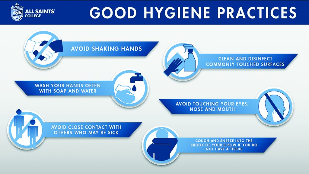
- Perth’s All Saints’ College shared Good Hygiene Practices with their school community through clear and branded infographics.
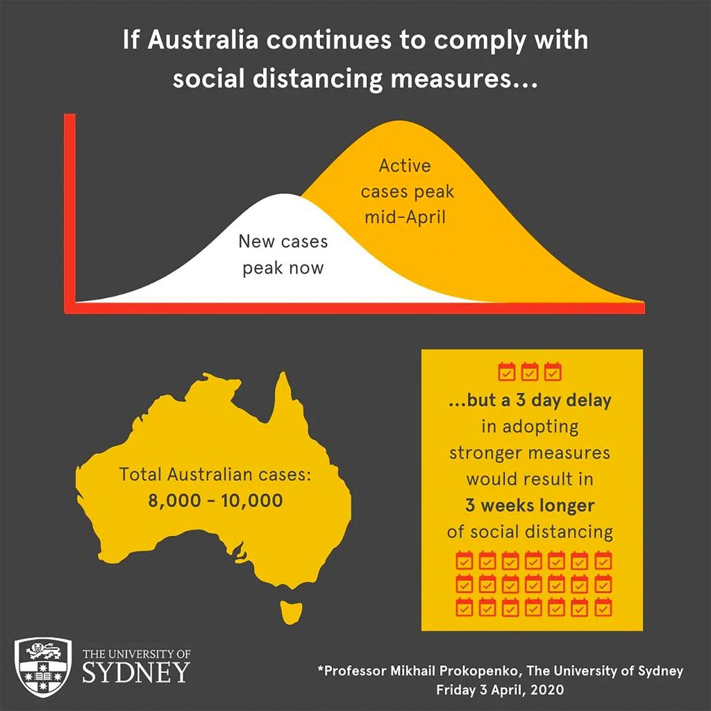
- The University of Sydney’s Professor Mikhail Prokopenko created a simple but effective infographic detailing the benefits of social distancing.
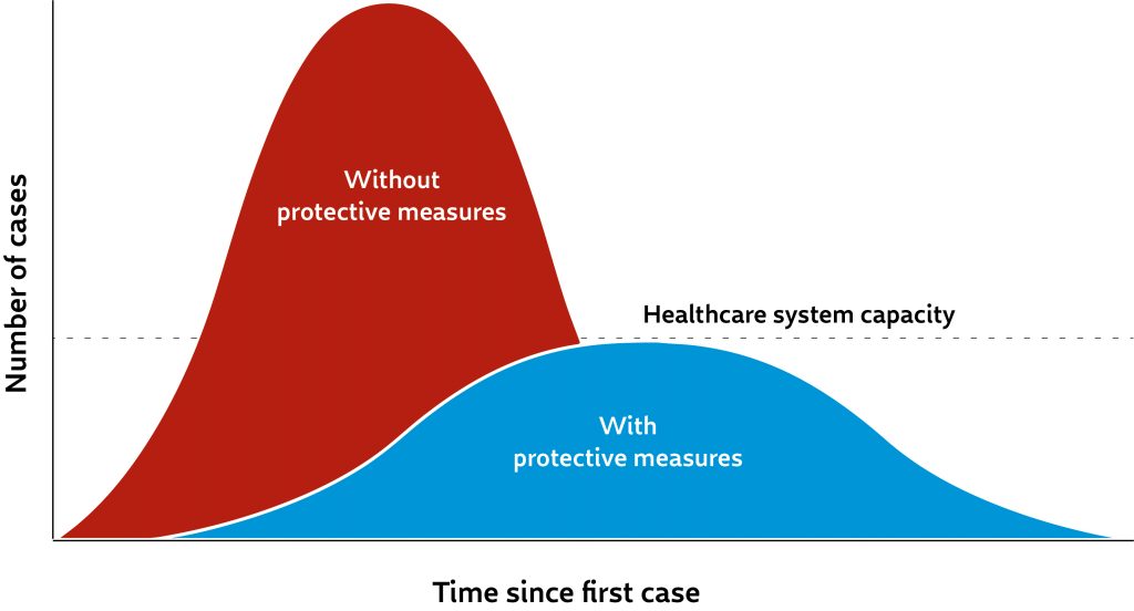
- The importance of implementing protective measures can be seen and easily understood in Sam Whitney’s design for Centers for Disease Control and Prevention (CDC) in the USA.
- Goodwin University used engaging infographics to teach their students how to manage home-based learning.
Conclusion
As the COVID-19 pandemic rumbles on it’s more important than ever to ensure that your school can deliver key messages succinctly to your staff, parents and students. Being at the forefront with vital, factual and relevant information will help build trust and confidence, affirm your school’s values and increase satisfaction.
Now is the time to be on the front foot and be known for providing reliable, intelligible and timely information that matters to the people who matter most to your school.
Insight applied
- Cut through ‘information overload’ with infographics.
- Know who you’re talking to.
- Be clear, concise and visually engaging.
- Ensure visual alignment with your brand to increase trust and satisfaction in your school.
1 Google Books
2 Google Trends


